MsRaster
MsRaster is an application for 2-dimensional visualization and flagging of visibility and spectrum data.
Infrastructure
Like Interactive Clean, MsRaster utilizes the Bokeh backend for plotting. Bokeh has built-in plot tools allowing the user to zoom, pan, select regions, inspect data values, and save the plot. Additional libraries are used in MsRaster for data I/O, logging, plotting, and interactive dashboards:

|

|

|
XRADIO (Xarray Radio Astronomy Data I/O) implements the MeasurementSet v4.0.0 schema using Xarray to provide an interface for radio astronomy data
toolviper is used for creating the Dask.distributed client and for logging
graphviper is used for Dask-based MapReduce to calculate statistics
Holoviz library hvPlot allows easy visualization of Xarray data objects as interactive Bokeh plots
Holoviz library Holoviews allows the ability to easily layout and overlay plots
Holoviz library Panel streamlines the development of apps and dashboards for the raster plots
Implementation
MsRaster creates raster plots for the user to view interactively or save to disk. The app can be used in three ways from Python:
create raster plots exported to .png files
create interactive Bokeh raster plots shown in a browser window
show a GUI dashboard in a browser window for selecting plot parameters to create interactive Bokeh raster plots
Data Exploration
XRADIO allows the user to explore MeasurementSet data with a summary of its metadata, and to make plots of antenna positions and phase center locations of all fields. These features can be accessed in MsRaster, as well as the ability to list MSv4 data groups and antenna names to aid in selection.
Raster Plots
MsRaster gives the user flexibility to set plot axes and the complex component, select data, aggregate along one or more data dimensions, iterate along a data dimension, style the plot, and layout multiple plots in a grid. All parameters available from the MsRaster function calls are also available in the interactive GUI.
Installation
Requirements
Python 3.11 or greater
-
optionally with python-casacore or casatools to enable conversion from MSv2 to MSv4
toolviper (installed with XRADIO)
To save plots, additional packages are required:
geckodriver for firefox, or chromedriver for chromium
Install
You may want to use the conda environment manager from miniforge to create a clean, self-contained runtime where casagui and the MsRaster dependencies can be installed:
conda create --name casagui python=3.12 --no-default-packages
conda activate casagui
Install required packages:
pip install casagui xradio graphviper hvplot
To install xradio with python-casacore for MSv2 conversion:
pip install "xradio[python-casacore]"
Note
On macOS it is required to pre-install python-casacore using
conda install -c conda-forge python-casacore.
It is also possible to use casatools as the backend for reading the MSv2. See the XRADIO casatools setup guide for more information.
Install packages to save plots to file (choose one):
conda install -c conda-forge selenium firefox geckodriver
conda install -c conda-forge selenium python-chromedriver-binary
pip install selenium chromedriver-binary
Dask.distributed Scheduler
For parallel processing workflows, you can set up a local Dask cluster using ToolVIPER. Dask.distributed is a centrally managed, distributed, dynamic task scheduler.
Prior to using MsRaster, you may elect to start a Dask Client (local machine) or a Dask LocalCluster (cluster). For a local client, set the number of cores and memory limit per core to use. The logging level for the main thread and the worker threads may also be set (default “INFO”). When plotting small datasets, however, this adds overhead which may make plotting slower than without the client.
ToolVIPER has an interface to create and access a local or distributed
client. See the
client tutorial
and help(local_client) or help(distributed_client) for more information.
Warning
If Python scripts are used to make plots, the client should not be created in the main thread. For more details, see Standalone Python scripts in the Dask Scheduling documentation.
Using MsRaster to Create Plots
In this simple example with no GUI, we import MsRaster, construct an MsRaster object, create a raster plot with default parameters, and show the interactive Bokeh plot in a browser tab:
from casagui.apps import MsRaster
msr = MsRaster(ms=myms)
msr.plot()
msr.show()
Construct MsRaster Object
>>> msr = MsRaster(ms=None, log_level='info', show_gui=False)
ms(str): path to MSv2 (usually .ms extension) or MSv4 (usually .zarr extension) file. Required when show_gui=False.log_level(str): logging threshold. Options include ‘debug’, ‘info’, ‘warning’, ‘error’, ‘critical’.show_gui(bool): whether to launch the interactive GUI in a browser tab.
MsRaster can be constructed with the ms path to a MSv2 or MSv4 file. If a
MSv2 path is supplied, it will automatically be converted to the MSv4 zarr
format in the same directory as the MSv2 with the extension .ps.zarr. For
more information on the MSv4 data format, see the XRADIO
Measurement Set Tutorial.
Warning
MSv2 files will be converted to zarr using the xradio default partitioning: data_description (spectral window and polarization setup), observation mode, and field. If the MSv2 to be converted has numerous fields, such as a mosaic, it is best to convert the MSv2 to zarr without field partitioning prior to using MsRaster.
The log_level can be set to the desired level, with log messages output to
the Python console. There is currently no log file option.
At construction, we decide whether to create the plots using MsRaster functions
(showgui=False) or using the interactive GUI (showgui=True). When the
GUI is shown, using MsRaster functions does not update the GUI widget selections
or the plot. The ms parameter is required when showgui=False, but
optional when this path can be set in the GUI.
Explore MS Data
Several MsRaster functions are available for exploring the MeasurementSet. The .zarr file is opened as an XRADIO ProcessingSet, which is an Xarray DataTree composed of MSv4s (see Measurement Set Tutorial for more information). XRADIO has added custom functions for data exploration in its ProcessingSetXdt class, which are available in MsRaster.
Some functions require that the MSv4 data groups name is specified. Data groups are
a set of related visibility/spectrum data, uvw, flags, and weights. Use
data_groups() to get a list of the data groups available in the MS:
>>> msr.data_groups()
{'base', 'model', 'corrected'}
Use summary() to view ProcessingSetXdt metadata for a specified
MSv4 data groups name, displayed in a tabular format. These column names and
values can be used to do selection for a plot:
>>> msr.summary(data_group='base', columns=None)
                    name                                                                            intents              shape polarization                        scan_name                         spw_name     field_name   source_name line_name                       field_coords  start_frequency  end_frequency
0  sis14_twhya_selfcal_0 [CALIBRATE_BANDPASS#ON_SOURCE, CALIBRATE_PHASE#ON_SOURCE, CALIBRATE_WVR#ON_SOURCE]  (20, 210, 384, 2)     [XX, YY]                              [4] ALMA_RB_07#BB_2#SW-01#FULL_RES_0  [J0522-364_0] [J0522-364_0]        []  [fk5, 5h22m57.98s, -36d27m30.85s]     3.725331e+11   3.727669e+11
1  sis14_twhya_selfcal_1 [CALIBRATE_BANDPASS#ON_SOURCE, CALIBRATE_PHASE#ON_SOURCE, CALIBRATE_WVR#ON_SOURCE]  (20, 171, 384, 2)     [XX, YY]                             [33] ALMA_RB_07#BB_2#SW-01#FULL_RES_0      [3c279_6]     [Unknown]        []  [fk5, 12h56m11.17s, -5d47m21.52s]     3.725331e+11   3.727669e+11
2  sis14_twhya_selfcal_2    [CALIBRATE_AMPLI#ON_SOURCE, CALIBRATE_PHASE#ON_SOURCE, CALIBRATE_WVR#ON_SOURCE]  (20, 190, 384, 2)     [XX, YY]                              [7] ALMA_RB_07#BB_2#SW-01#FULL_RES_0      [Ceres_2] [J1037-295_2]        []   [fk5, 6h10m15.95s, 23d22m06.91s]     3.725331e+11   3.727669e+11
3  sis14_twhya_selfcal_3                               [CALIBRATE_PHASE#ON_SOURCE, CALIBRATE_WVR#ON_SOURCE]  (80, 210, 384, 2)     [XX, YY] [10, 14, 18, 22, 26, 30, 34, 38] ALMA_RB_07#BB_2#SW-01#FULL_RES_0  [J1037-295_3]    [TW Hya_3]        [] [fk5, 10h37m16.08s, -29d34m02.81s]     3.725331e+11   3.727669e+11
4  sis14_twhya_selfcal_4                                                         [OBSERVE_TARGET#ON_SOURCE] (270, 210, 384, 2)     [XX, YY]         [12, 16, 20, 24, 28, 36] ALMA_RB_07#BB_2#SW-01#FULL_RES_0     [TW Hya_5]     [3c279_4]        [] [fk5, 11h01m51.80s, -34d42m17.37s]     3.725331e+11   3.727669e+11
If a subset of columns is of interest, set the columns parameter to one or
more column names:
>>> msr.summary(data_group='base', columns='intents')
>>> msr.summary(data_group='base', columns=['spw_name', 'shape'])
>>> msr.summary(data_group='base', columns=['spw_name', 'start_frequency', 'end_frequency'])
To view the summary information grouped by MSv4, set columns='by_ms' (only
the first MS is shown here):
>>> msr.summary(data_group='base', columns='by_ms')
MSv4 name: sis14_twhya_selfcal_0
intent: ['CALIBRATE_BANDPASS#ON_SOURCE', 'CALIBRATE_PHASE#ON_SOURCE', 'CALIBRATE_WVR#ON_SOURCE']
shape: 20 times, 210 baselines, 384 channels, 2 polarizations
polarization: ['XX' 'YY']
scan_name: ['4']
spw_name: ALMA_RB_07#BB_2#SW-01#FULL_RES_0
field_name: ['J0522-364_0']
source_name: ['J0522-364_0']
line_name: []
field_coords: (fk5) 5h22m57.98s -36d27m30.85s
frequency range: 3.725331e+11 - 3.727669e+11
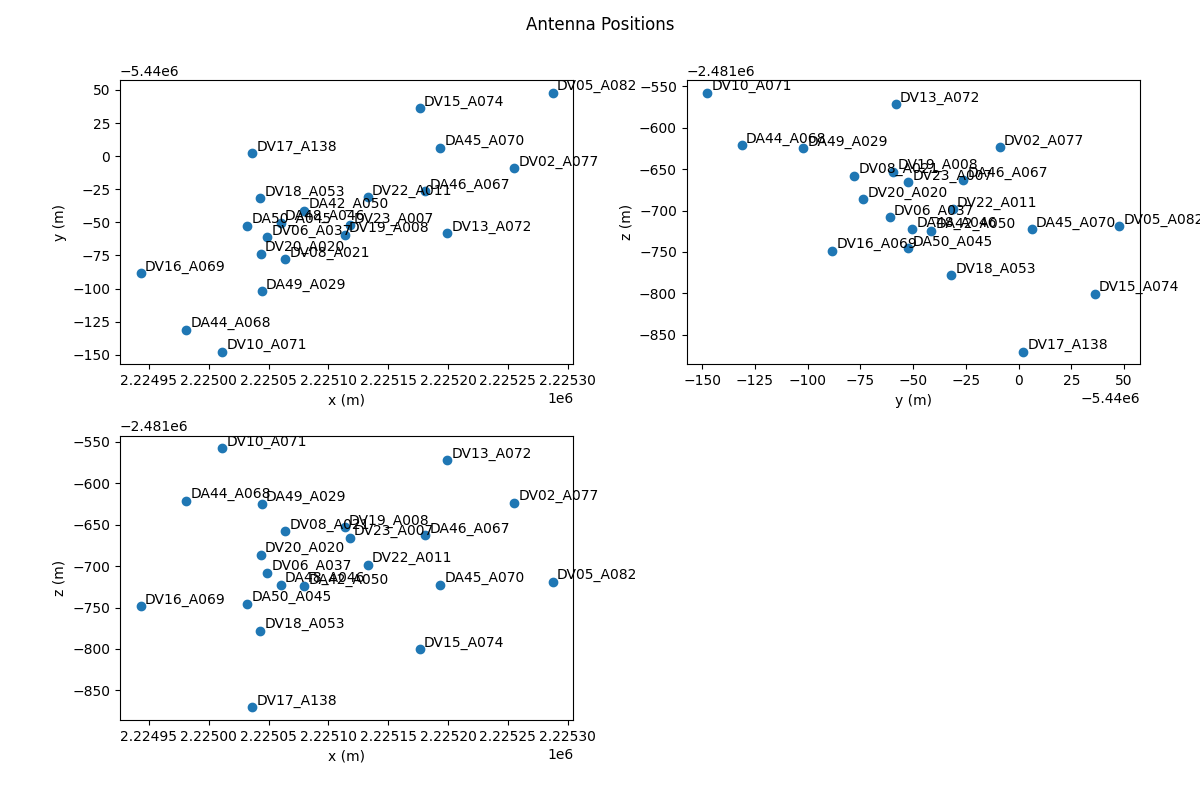
The antennas() function returns a list of antenna names, which can be used
to select baseline, antenna1, or antenna2. This function has been combined with
the XRADIO ProcessingSetXdt function to plot the antenna positions,
optionally labeled by name:
>>> antenna_names = msr.antennas(plot_positions=False, label_antennas=False)
>>> print(antenna_names)
['DA42_A050', 'DA44_A068', 'DA45_A070', 'DA46_A067', 'DA48_A046', 'DA49_A029', 'DA50_A045',
'DV02_A077', 'DV05_A082', 'DV06_A037', 'DV08_A021', 'DV10_A071', 'DV13_A072', 'DV15_A074',
'DV16_A069', 'DV17_A138', 'DV18_A053', 'DV19_A008', 'DV20_A020', 'DV22_A011', 'DV23_A007']
When plotting antenna positions with label_antennas=False, the antenna
names can be shown by hovering over the antenna position. Sample antenna plot
with label_antennas=True:
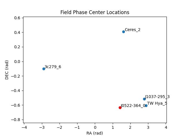
MsRaster includes the XRADIO ProcessingSetXdt function
plot_phase_centers() to plot the phase center locations of all fields in a
data group. You may optionally label the fields by name:
>>> msr.plot_phase_centers(data_group='base', label_fields=False)
When label_fields=False, the central field is highlighted in red based on
the closest phase center calculation, and the legend shows the central field
name. Otherwise, all fields are named and the central field is red. Sample plot
with label_fields=True:
Style Raster Plots
By default, MsRaster uses the Viridis colormap for unflagged data and the
Reds colormap for flagged data, and shows colorbars for both types of data.
Use the set_style_params() function to change these settings. These style
settings will then be used for all plots for the MsRaster object:
>>> msr.set_style_params(unflagged_cmap='Viridis', flagged_cmap='Reds', show_colorbar=True,
show_flagged_colorbar=True)
Use colormaps() to get the list of available colormaps, which are the
same ones used in Interactive Clean:
>>> msr.colormaps()
['Blues', 'Cividis', 'Greens', 'Greys', 'Inferno', 'Magma', 'Oranges', 'Plasma', 'Purples',
'Reds', 'Turbo', 'Viridis']
It is expected that in the future, additional style settings will be available, such as fonts for plot labels. It is also possible that in the future these settings will be able to be saved in a config.py file.
Create Raster Plot
Use plot() to create each raster plot, which can then be shown (see Show Raster Plot) or saved (see Save Raster Plot):
>>> msr.plot(x_axis='baseline', y_axis='time', vis_axis='amp', selection=None,
aggregator=None, agg_axis=None, iter_axis=None, iter_range=None, subplots=None,
color_mode=None, color_range=None, title=None, clear_plots=True)
x_axisandy_axis(str): select the axes to plot from the data dimensions ‘time’, ‘baseline’ (‘antenna_name’ for spectrum data), ‘frequency’, and ‘polarization’. For spectrum data, ‘baseline’ is equivalent to ‘antenna_name’ since it is the defaultx_axis.Default x_axis: baseline
Default y_axis: time
vis_axis(str): The complex component of the visibility data has options ‘amp’, ‘phase’, ‘real’, and ‘imag’. For spectrum data, only ‘amp’ and ‘real’ are valid, with ‘amp’ equivalent to ‘real’ since it is the defaultvis_axis.Default vis_axis: amp
selection(None, dict): select data using a dictionary of keyword/value pairs. Selections may be made from the XRADIO ProcessingSetXdt or MSv4 by value:ProcessingSetXdt: use the summary column names as keys and the column value(s) as valid options (see summary()). Since the ProcessingSetXdt summary is a Pandas DataFrame, selection can also be done as a Pandas query with keyword
'query'. The MSv4 data groups name for correlated data may also be selected (see data_groups()). Some selections will be made automatically if not user-selected (see note below). Example selections:selection = {‘data_group’: ‘corrected’, ‘intents’: ‘OBSERVE_TARGET#ON_SOURCE’, ‘field_name’: ‘TW Hya_5’}
selection = {‘query’: ‘field_name=[“3c279_6”, “TW Hya_5”], scan_name=[“33”, “36”]’}
selection = {‘query’: ‘start_frequency > 100e9 AND end_frequency < 200e9’}
MSv4: select the data dimensions. Some selections will be made automatically if not user-selected (see note below):
'time': ???'frequency': ???'baseline','antenna1'andantenna2': select antenna names or baselines as ‘ant1_name & ant2_name’ (see antennas()).'polarization': use summary(columns=’polarization’) for valid options (see summary()).
Default selection: None (use automatic selection).
Note
Automatic selection: Since MsRaster creates a 2D plot from 4D data, some selections must be done automatically if not selected by the user. These selections include:
spw_name: for consistent data shapes, the first spectral window (by spectral_window_id) is selected.
data_group: default ‘base’.
data dimensions: the dimensions not chosen for
x_axis,y_axis, aggregationagg_axisor iterationiter_axisare automatically selected. After user selections are applied, the set of dimension values are sorted, and the first is used. Time and frequency are numeric values. For baseline, names are formed as ‘ant1_name & ant2_name’ strings and sorted, then the first pair in the list is selected. For polarization, the names are converted to casacore Stokes enum values, sorted, and the first in the list is selected and converted back to a name for value selection.
aggregator(None, str): the reduction function to apply along theagg_axisdimension(s) of all correlated data in the data group (VISIBILITY/SPECTRUM, WEIGHT, and FLAG). Aggregator options include ‘max’, ‘mean’, ‘min’, ‘std’, ‘sum’, and ‘var’. The reduction is applied after thevis_axiscomponent is applied. Flags and weights are not used in the aggregation but are aggregated.Default aggregator: None
agg_axis(None, str, list): which dimension(s) to apply theaggregatoracross. Cannot includex_axisory_axis. Ignored ifaggregator=None. The entire dimension(s) are aggregated. If agg_axis is a single dimension, the remaining dimension is selected automatically as described above. Ifagg_axis=None, all remaining dimensions are aggregated.Default agg_axis: None
iter_axis(None, str): dimension along which to iterate to create multiple plots. Cannot bex_axisory_axis. Select the iteration index range withiter_range.Default iter_axis: None
iter_range(None, tuple): (start, end) inclusive index values for creating iteration plots. Use (0, -1) for all iterations. Warning: you may trigger a MemoryError with many iterations. Iterated plots can be shown or saved in a grid (seesubplots) or saved individually (see Save Raster Plot).Default iter_range: None (equivalent to (0, 0), first iteration only)
subplots(None, tuple): set a plot layout of (rows, columns). Use withiter_axisanditer_range, orclear_plots=False. If the layout size is less than the number of plots,subplotswill limit the plots in the layout. Similarly, if the number of plots is less than thesubplotssize, the plots will appear in the layout according to the number of columns but fewer rows. The lastsubplotssetting will be used in Show Raster Plot and Save Raster Plot.Default subplots: None (single plot, equivalent to (1, 1))
color_mode(None, str): Whether to limit the colorbar range. Options include None (use data limits), ‘auto’ (calculate limits for amplitude), and ‘manual’ (usecolor_range). ‘auto’ is equivalent to None ifvis_axisis not ‘amp’. ‘manual’ is equivalent to None ifcolor_range=None. Automatic limits for amplitudes are calculated from statistics for the unflagged data in the spectral window, which use GraphVIPER MapReduce for fast computation. The range is clipped to 3-sigma limits to brighten weaker data values.Default color_mode: None (use data limits)
color_range(None, tuple): (min, max) of colorbar to use ifcolor_mode='manual', else ignored.Default color_range: None (use data limits)
title(None, str): Plot title. Options include None, ‘ms’ to generate a title from themsname appended withiter_axisvalue (if any), or a custom title string.Default title: None (no plot title).
clear_plots(bool): whether to clear the list of previous plot(s). Set to False to create multiple plots and show them in a layout withsubplots. This option is not currently available in the interactive GUI.Default clear_plots: True (remove previous plots)
Examples:
Aggregation: time vs. baseline averaged over frequency, with the first polarization selected automatically:
>>> msr.plot(x_axis='baseline', y_axis='time', aggregator='mean', agg_axis='frequency')
Aggregation: time vs. baseline averaged over frequency, with polarization selection:
>>> msr.plot(x_axis='baseline', y_axis='time', selection={'polarization': 'YY'},
aggregator='mean', agg_axis='frequency')
Aggregation: time vs. baseline averaged over frequency and polarization (equivalent to
agg_axis=['frequency', 'polarization']):>>> msr.plot(x_axis='baseline', y_axis='time', aggregator='mean')
Iteration layout: time vs. baseline for the first six frequencies in 2 rows, with the first polarization selected automatically:
>>> msr.plot(iter_axis='frequency', iter_range=(0, 5), subplots=(2, 3))
Multiple plots layout: time vs. baseline for ‘amp’ and ‘phase’ in one row, with the first frequency and polarization selected automatically:
>>> msr.plot(vis_axis='amp')
>>> msr.plot(vis_axis='phase', subplots=(1, 2), clear_plots=False)
Aggregation and iteration layout: time vs. frequency for the max across baselines, iterated over all polarizations, in a 2x2 layout with a clipped colorbar range:
>>> msr.plot(x_axis='frequency', y_axis='time', vis_axis='amp', aggregator='max',
agg_axis='baseline', iter_axis='polarization, iter_range=(0, -1), subplots=(2, 2),
color_mode='auto')
Show Raster Plot
After a plot is created (see Create Raster Plot), it may be shown in a browser
tab with show(), which has no parameters:
>>> msr.show()
If multiple plots were created (with iter_axis or clear_plots=False) in
a subplots layout, the plots are connected so that the Bokeh plot tools such
as pan and zoom act on all plots in the layout.
To show the plot, Holoviews renders the plot to a Bokeh figure, then Bokeh show() saves the plot to an HTML file in a temporary directory and automatically opens the file in the browser.
Save Raster Plot
After a plot is created (see Create Raster Plot), it may be saved to a file with
save().
>>> msr.save(filename='', fmt='auto', width=900, height=600)
filename(str): Name of file to save. Default ‘’: the plot will be saved as {ms}_raster.{ext}. If fmt is not set, plot will be saved as .png.fmt(str): Format of file to save (‘png’, ‘svg’, ‘html’, or ‘gif’). Default ‘auto’: inferred from filename extension.width(int): width of exported plot.height(int): height of exported plot.
As in Show Raster Plot, multiple plots can be saved in a layout using the
subplots parameter in the Create Raster Plot plot() function. This
layout plot will be saved to a single file with filename.
However, if iteration plots were created and subplots is a single plot
(None or (1, 1)), the iteration plots will be saved individually with a plot
index appended to the filename according to the iter_range index range:
{filename}_{index}.{ext}.
When save() is called, as with show() the plot is exported to an HTML
file. If the file format is .png, the exported plot will be rendered as a
PNG, which currently requires Selenium and either firefox and geckodriver
or chromium browser and chromedriver (see Install).
Warning
If you have rendered the plot with show(), it is much faster to save
the plot with the Bokeh save tool than with save().
Iteration save() examples:
Create plots for the first four frequencies, and save them in a 2x2 layout:
>>> msr.plot(iter_axis='frequency', iter_range=(0, 3), subplots=(2, 2))
>>> msr.save(filename='iter_freq_layout.png')
Create plots for a range of frequencies, and save them individually with an index (in this example: iter_freq_10.png, iter_freq_11.png, iter_freq_12.png, iter_freq_13.png):
>>> msr.plot(iter_axis='frequency', iter_range=(10, 13))
>>> msr.save(filename='iter_freq.png')
Create plots for all polarizations, and save them individually with an index (in this case, iter_pol_0.png, iter_pol_1.png, etc. depending on the number of polarizations):
>>> msr.plot(iter_axis='polarization', iter_range=(0, -1))
>>> msr.save(filename='iter_pol.png')
Use Interactive GUI
As mentioned in Construct MsRaster Object, use showgui=True to launch the
interactive GUI. In this case, an ms path can be supplied but is not
required.
>>> msr = MsRaster(ms=None, log_level='info', show_gui=True)
The GUI will immediately launch in a browser tab. If ms is set, a plot with
default parameters is created and shown in the GUI.
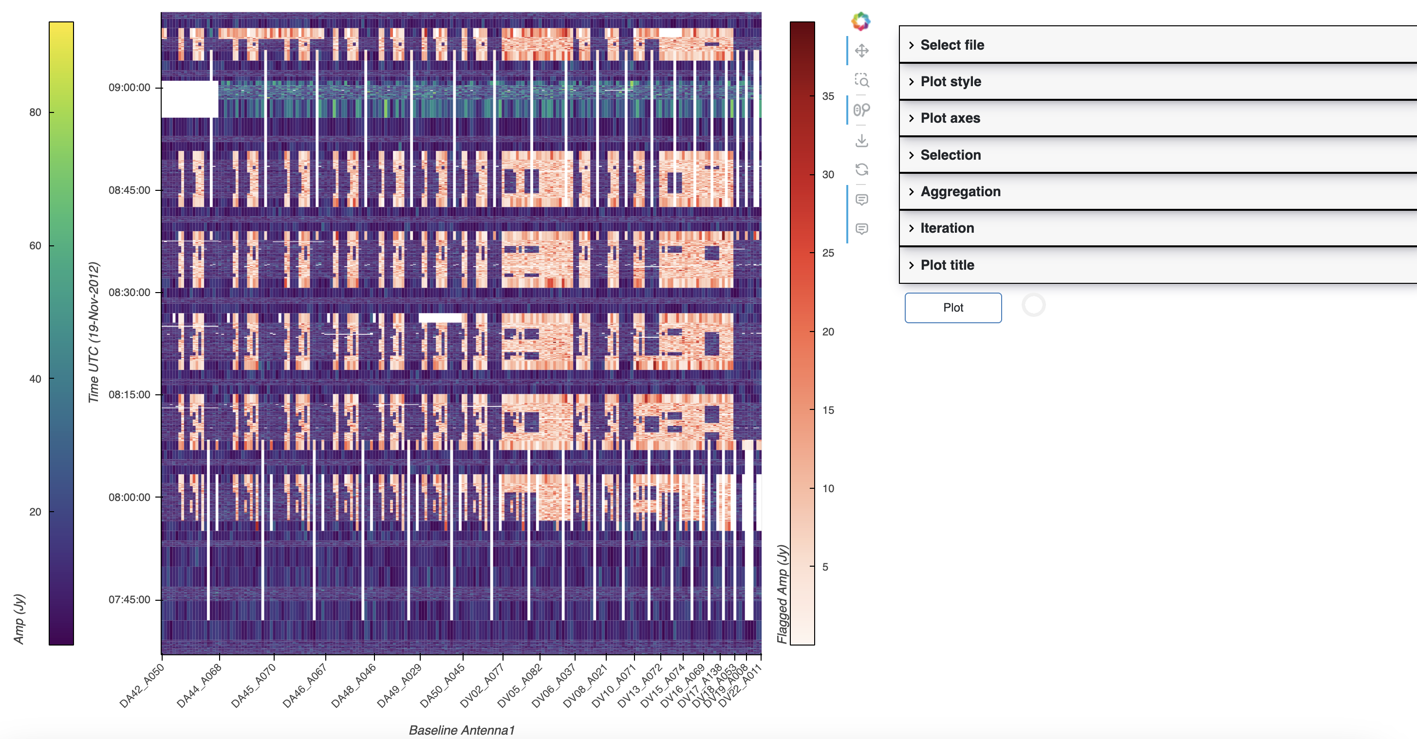
Each section of the plot inputs on the right side of the GUI corresponds to the MsRaster plot parameters:
Construct MsRaster Object parameters:
Select file:
ms
Style Raster Plots parameters:
Plot style:
unflagged_cmap,flagged_cmap,show_colorbar,show_flagged_colorbar
Create Raster Plot parameters:
Plot axes:
x_axis,y_axis,vis_axisSelection:
selectionAggregation:
aggregator,agg_axisIteration:
iter_axis,iter_range,subplotsPlot title:
title
Plot: the Plot button will change from outline to solid when the plot
inputs change. Click Plot to render the plot.
Note
Iterated plots in a layout will be shown in a Bokeh plot in a new browser tab. There is currently no way to create multiple plots in the GUI except by iteration.